chemist4u - management tool
ux/ui optimisation of an internal tool for an online pharmacy
00

problem
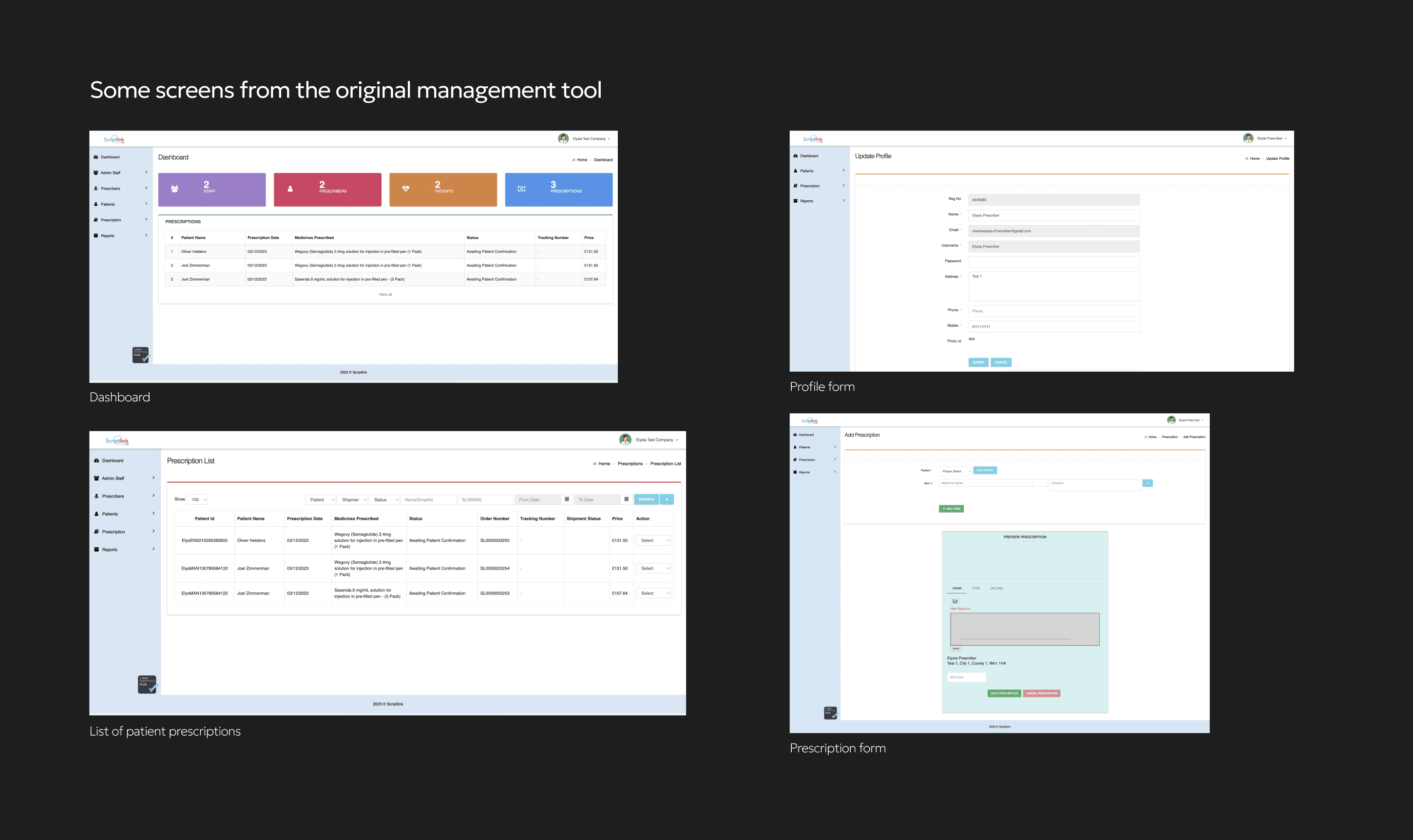
Chemist4U's internal prescription management tool was found to be difficult to navigate and use by members of staff needing to manage vital patient information. The UI in general was very outdated so the CEO reached out to see if I could carry out an audit and support with a UX redesign.
solution
The output was a fully optimised redesign of the management tool, with streamlined table, navigation and form components. The foundations of a design system was also provided ensure visual consistency as it evolves and expands.
Context
Chemist4U provide a repeat prescription delivery service to residents in the UK, allowing customers to manage their orders and speak with healthcare professionals conveniently in the app. I
Understanding who it's for
The main core ask was to improve the usability of the extensively used and complex dashboard which was accessed by different members of staff: prescribers, administrators and finance. This added the complexity of considering different permission levels and ensuring each member type can easy achieve their goals.
Phase 1: Audit
To familiarise myself with the various permission levels and tool itself, I carried out a high-level UX audit. This played a part in helping myself and the product owner break down and prioritise different areas, with the most used/most complex ones being a starting point.
Phase 2: Benchmarking
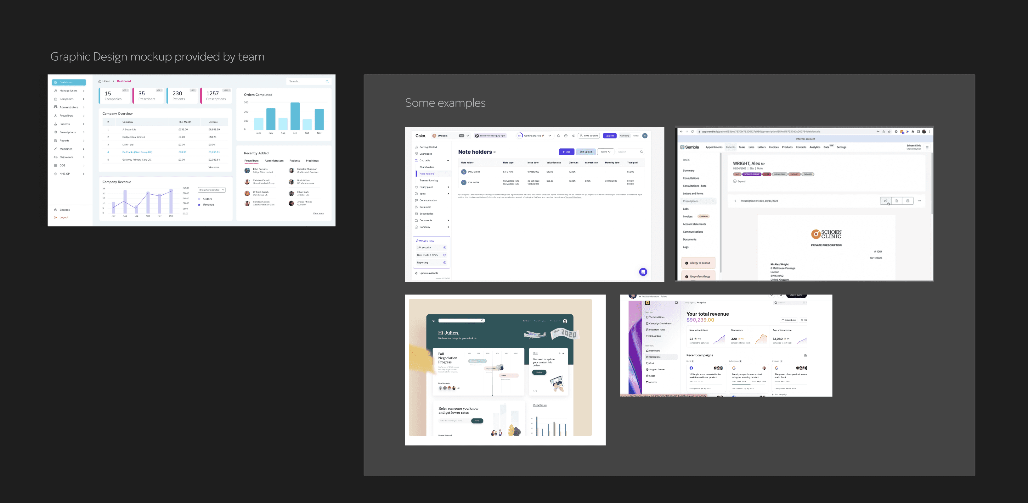
I benchmarked other dashboards and information management systems for inspiration and learning. Most of the examples I looked at had very clean, no frills UI with the focus being on the actions available. This was the approach I wanted to take anyway, so I created a bit of a vision board/plan for myself to refer back to going forward.
Phase 3: Low-fi ideation
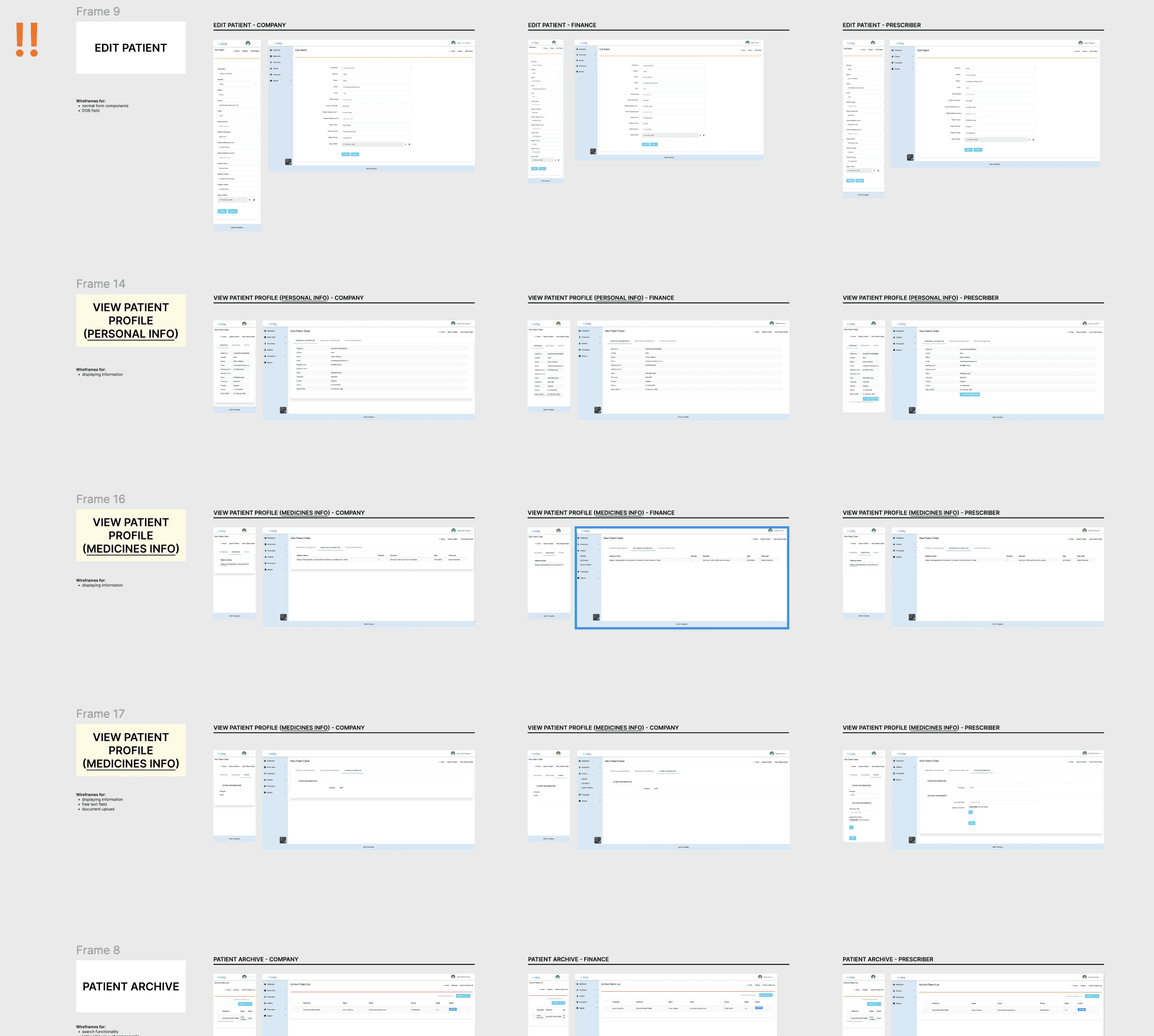
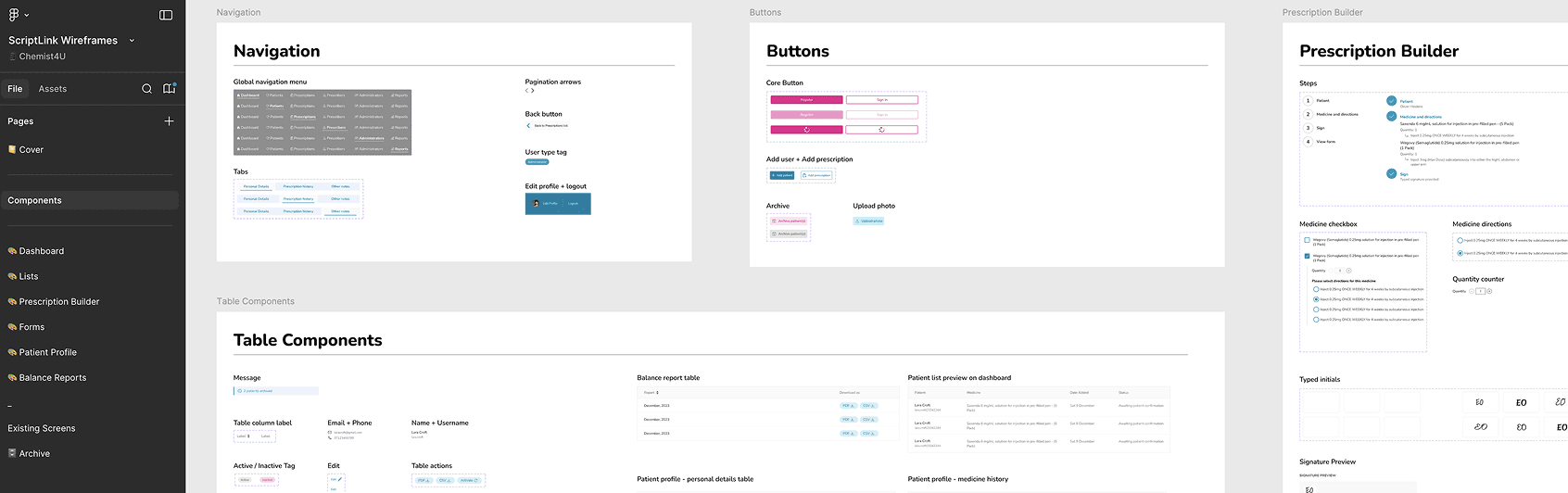
Starting with the quick wins, I started with the list pages as had a very similar table component just with different actions depending on the user's permission level and list type (e.g. patients, prescriptions, financial overview etc). A design language started to develop, so to make my workflow more efficient, I started 'banking' reusable components in a lightweight design system.
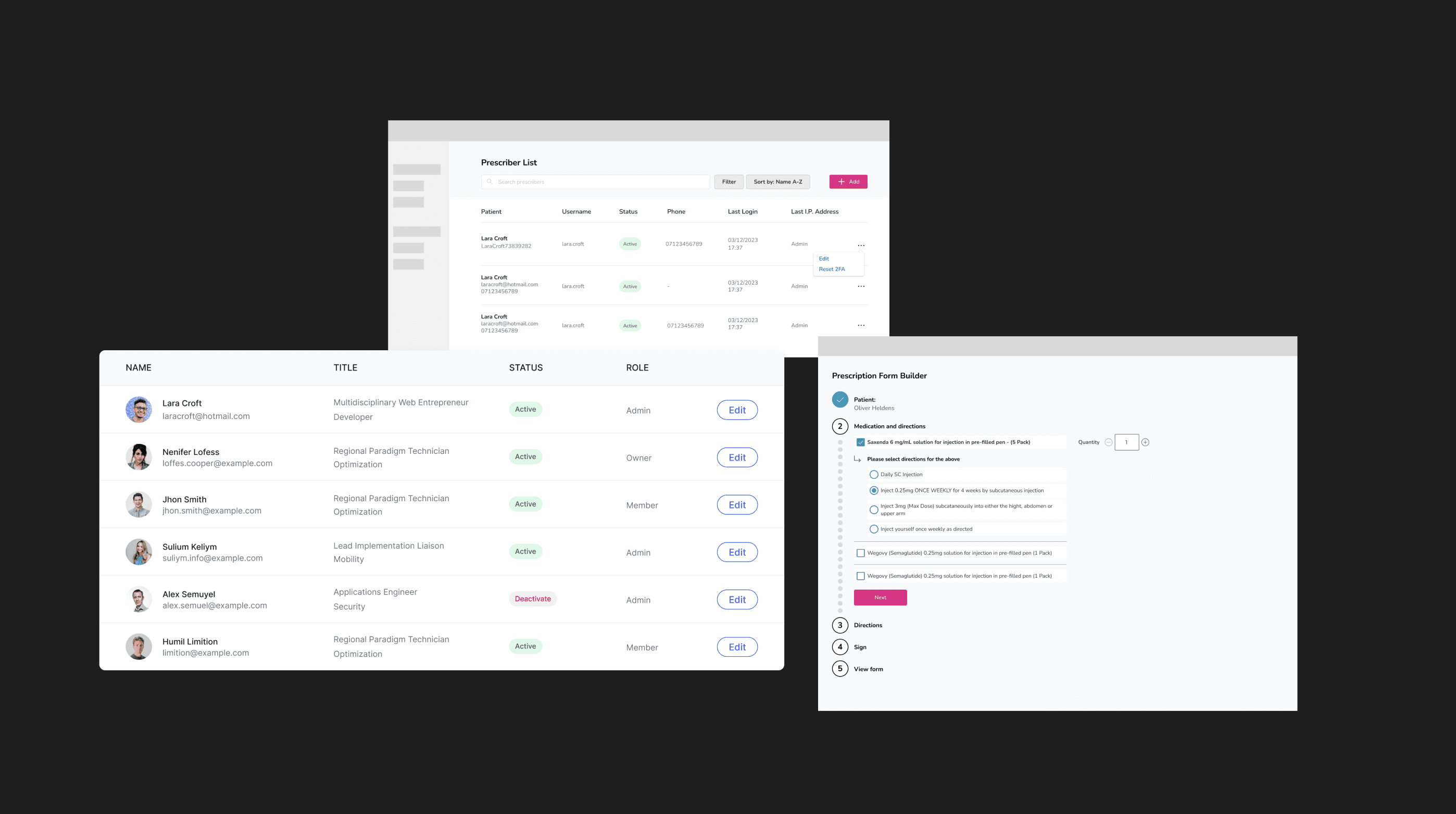
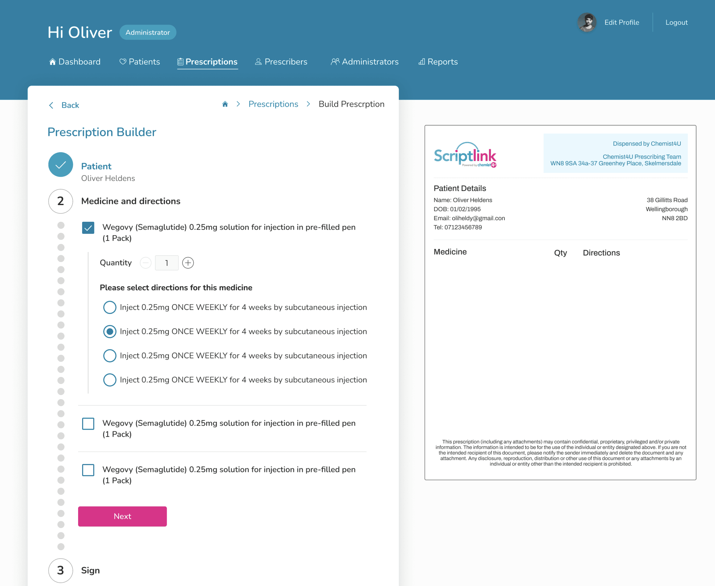
Prescription Builder
One of the most used actions was the prescription builder which prescribers used to build prescriptions for patients. It was a multi-step form that required:
multi-selection of medicine
quantity selector
the ability to provide a digital signature
a preview of the printable prescription
Using the benchmarking examples and my own previous experience building multi-step forms for clients, I designed a modern and intuitive form with a preview that updates dynamically as the form is filled out. To reduce the risk of mistakes due to visual clutter, I proposed the use expandable components to allow for the completion of one step at a time. For example, only displaying the quantity selector for medicine that has been selected.
The final result was an annotated user journey containing all of the steps.
Phase 4: Stakeholder review and moving to higher fidelity
Once I'd mapped out the agreed core user flows, I walked the team through the design proposals and sense checked them with internal staff. The key stakeholders and subject matter experts were pleased with the direction so my focus shifted to delivery and I prepared higher-fidelity screens and any additional journeys.
Phase 5: Preparing deliverables - designs and design system
The agreed deliverables were:
user flows for the three user types: admin, prescriber, finance
ux audit of the existing platform
ui overhaul with existing branding
These were handed over upon completion with an additional design system as I preemptively wanted the team to be prepared for any future iterations. This was something I handed over more for the developers to use as documentation for the various components I'd added, and I later learned that they had used the components as a guide for customer-facing website as well.
focus areas
ux optimisation, ui rebrand, ui refinement, usability
tools
figma
category
UX Optimisation
project learnings
This was a rewarding piece of work as I was contributing to the improvement of a platform used for a valuable service such as prescription delivery. I soon learned that the quality of internal tools can have a great impact on the end result (e.g. delivery times, accuracy) so I felt happy to have made even a small impact on the internal staff at Chemist4U.